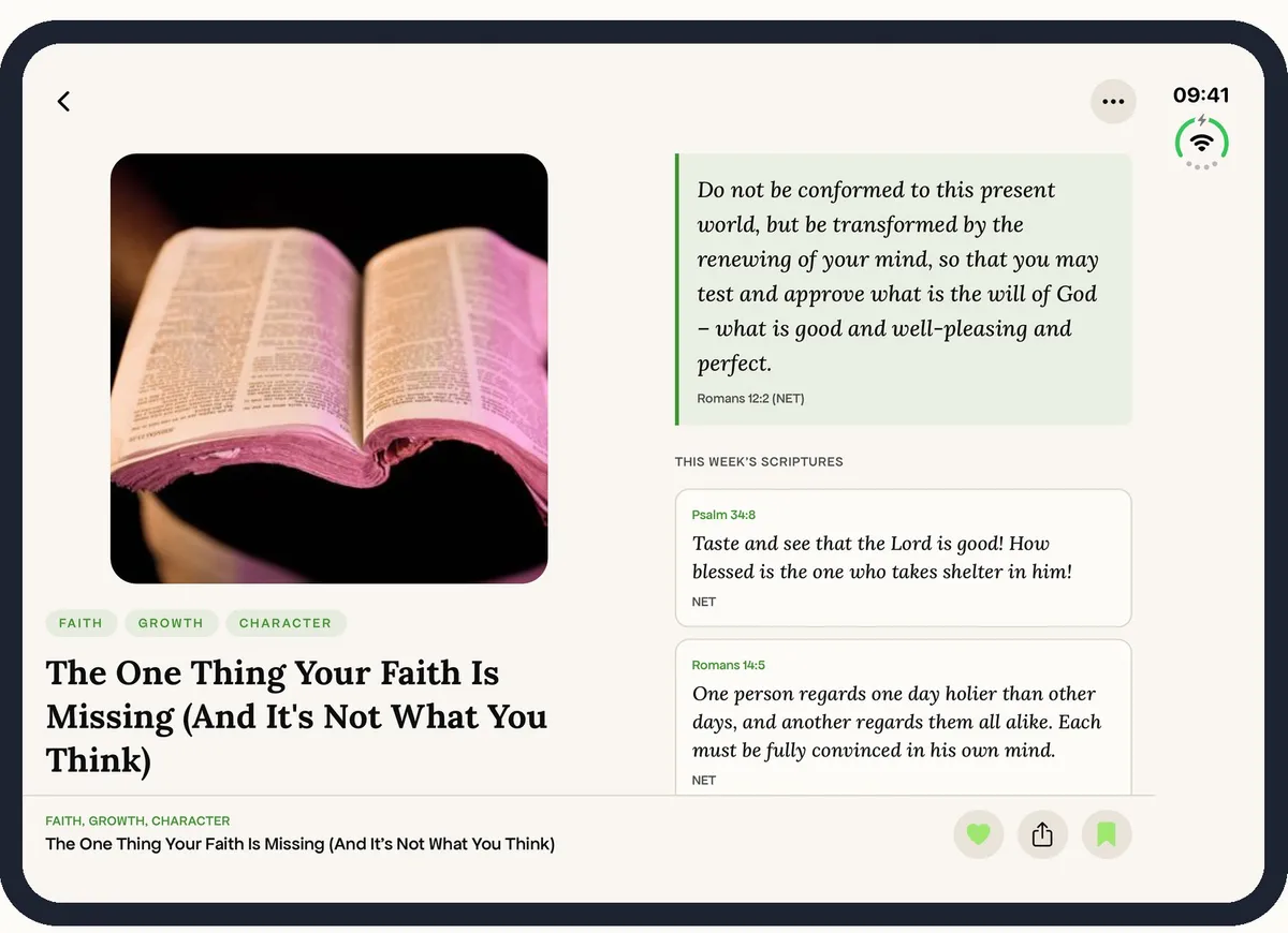
ISIT on iPhone Duo
I tested my devotional app against the five poses of Apple's foldable iPhone and redesigned the layouts that broke.
I researched Apple's foldable iPhone Duo, mocked up every pose at true size and redesigned my devotional app for it. The update ships in version 1.8.
The new phone and the problem
The iPhone Duo went on sale on 23 October 2026. ISIT was designed for one tall screen and locked to portrait. I needed to find what would break when the phone opened.
What the research said
- 2
- Screens5.4″ outside at 466×678pt. 7.6″ inside at 890×626pt, hinge down the middle.
- 5
- Poses to design forClosed, sideways, open, book and tabletop. Apple says lay out by size class.
- 27.1
- SDK to fill the screenApps built earlier run letterboxed, and many don't work properly yet.
From launch coverage, reviews and developer write-ups. Apple's own spec page could not be opened at the time, so the figures are as reported.
What I found
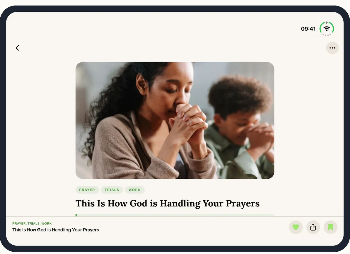
- The inner screen ignores the portrait lock, so ISIT opens sideways.
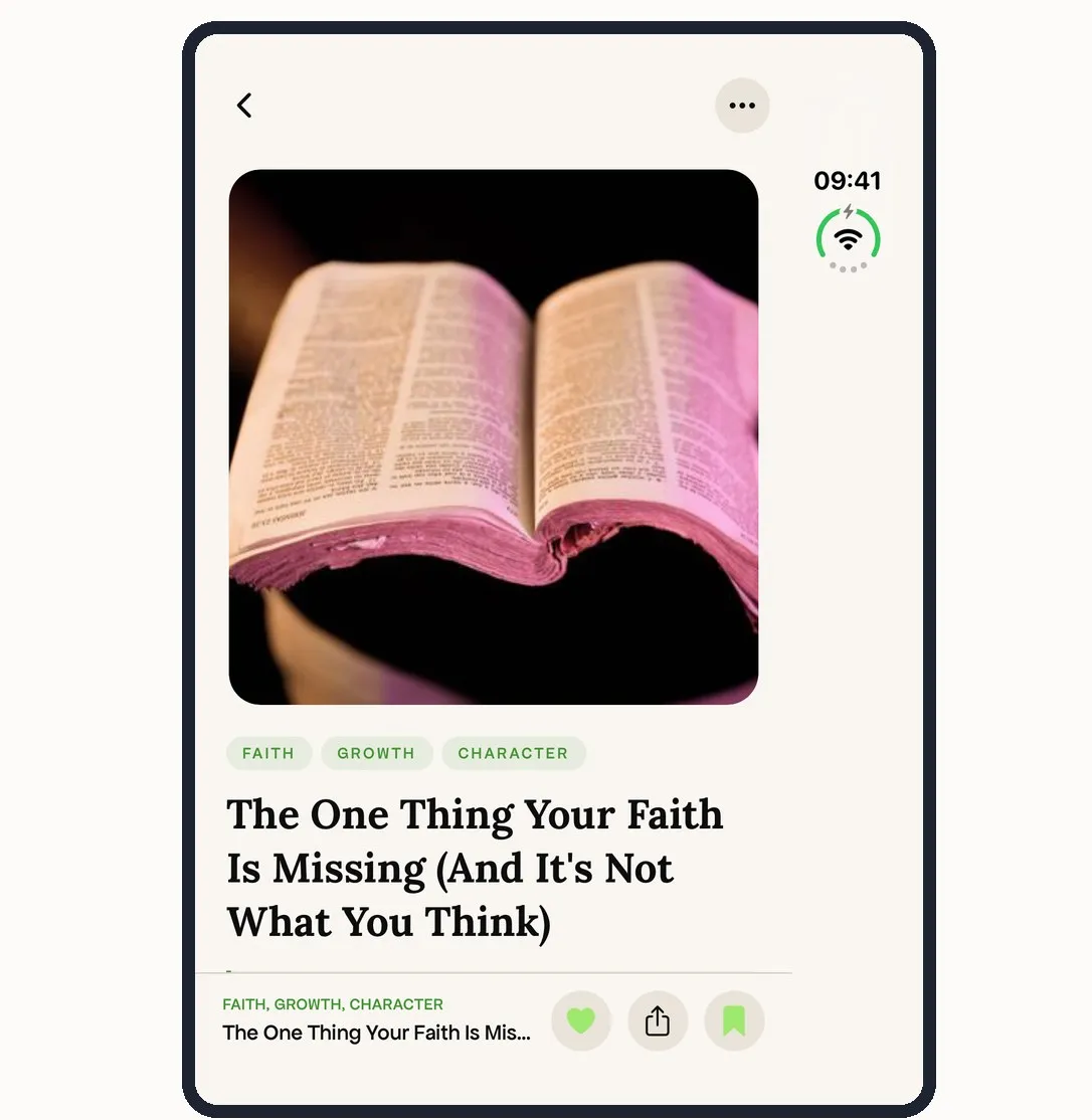
- A devotional's photo is 560pt tall on a 626pt screen. The title barely shows.
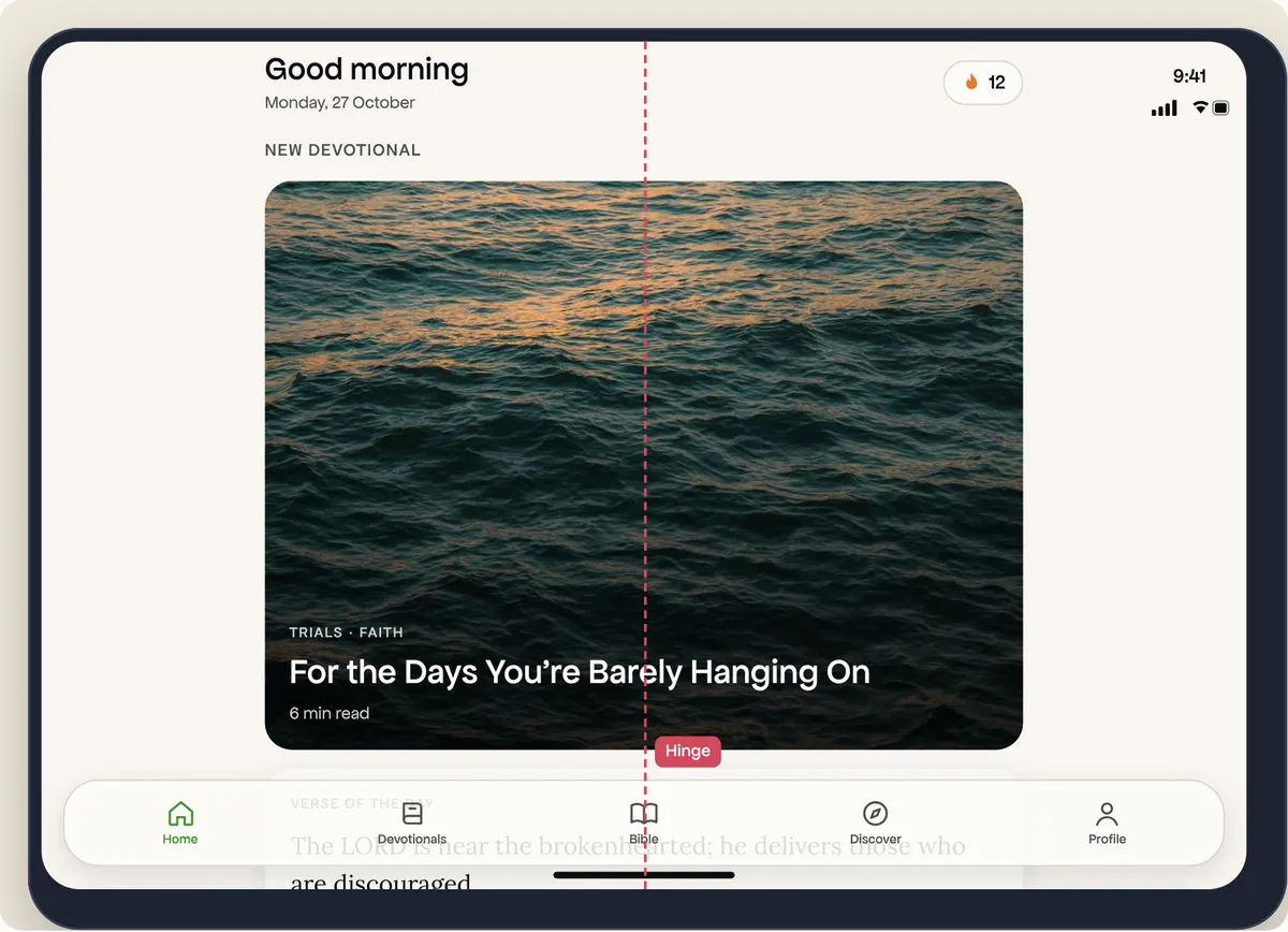
- Home is a 600pt strip with the hinge through every card.
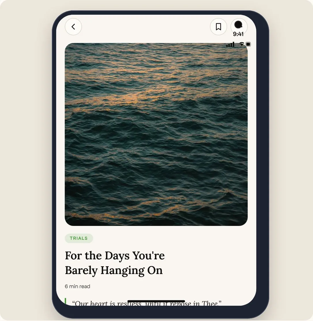
- Folded, text and buttons sit under the status bar strip down the side.
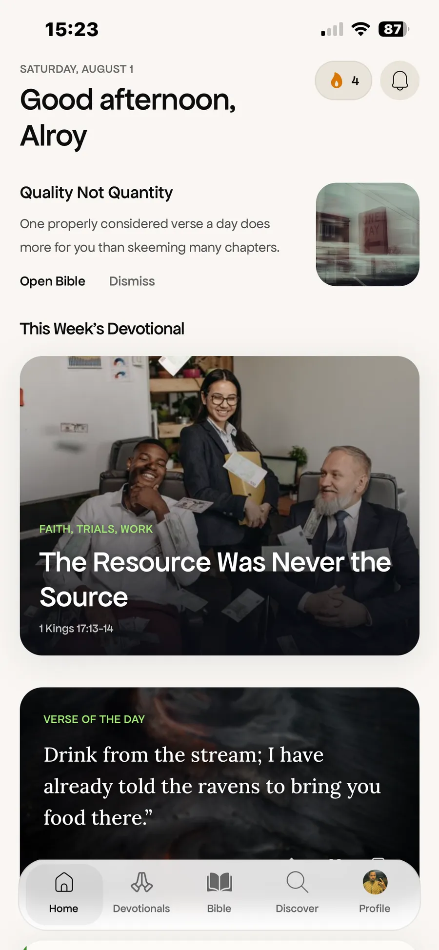
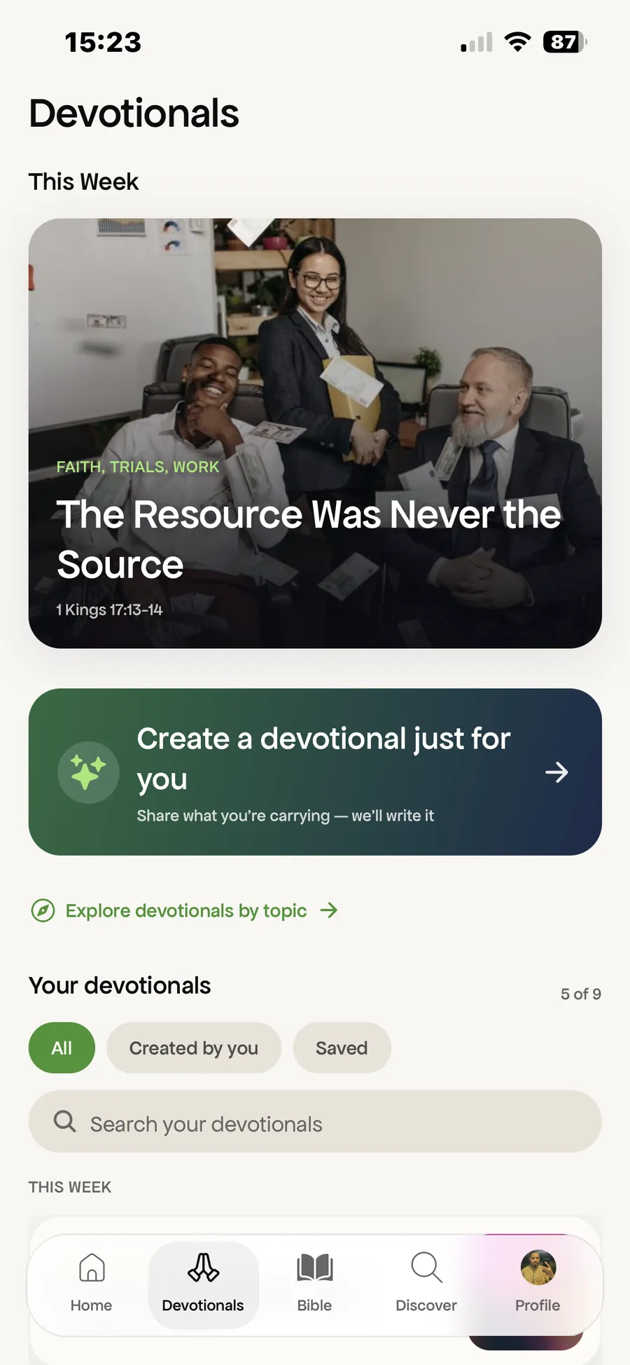
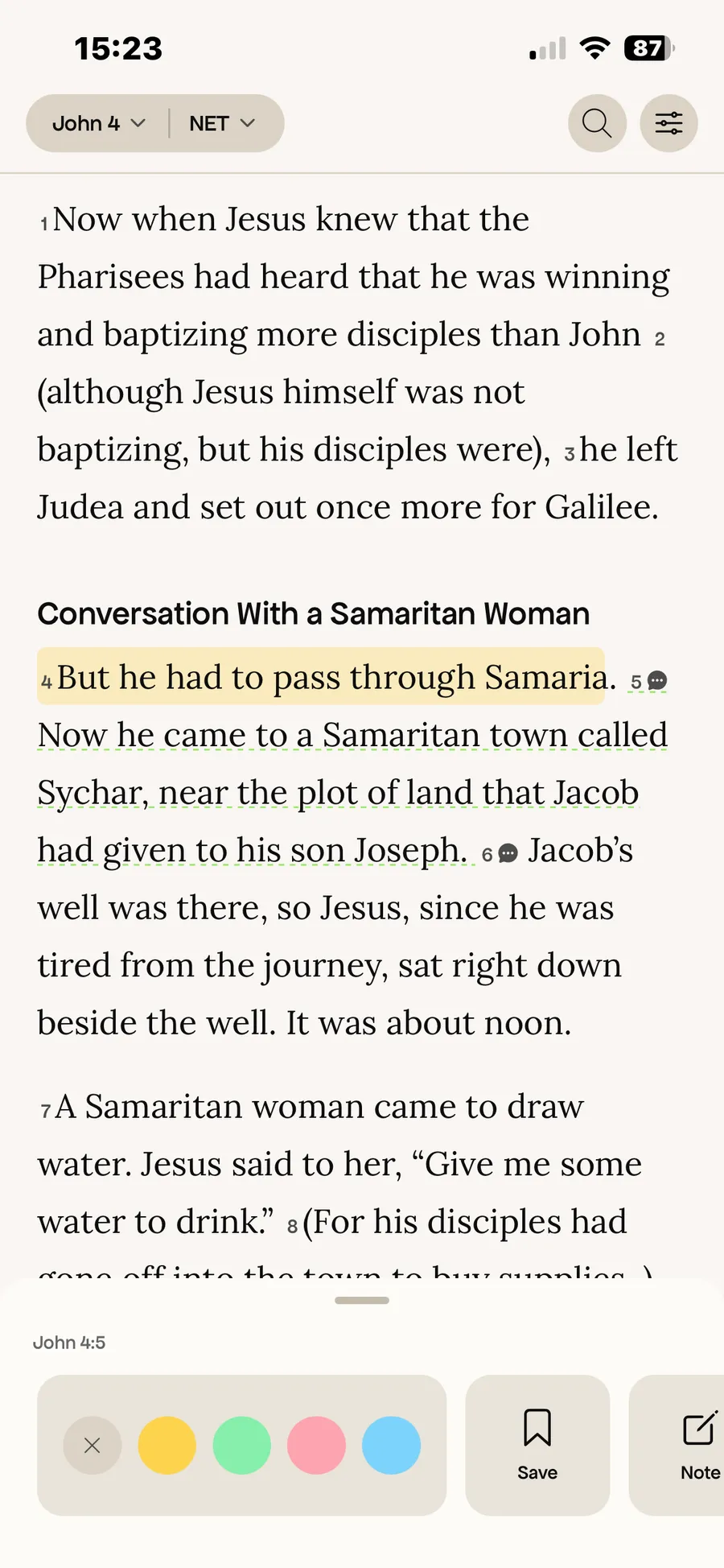
ISIT on a normal phone
The single-column layout works well on the outer screen.
Before and after
Version 1.7 against real 1.8 captures from the Duo simulator. Photos capped at half the screen height, two panes split at the fold. Tabletop comes later.